
The most pleasant color for the eye is considered green. As a rule, it is associated with positive emotions, because it resembles summer grass and bright foliage. If the interior is performed with the predominance of this shade, then the room will be able to create a calm and peaceful atmosphere. Scientists have proven that green helps reduce stress and smooth out any conflict.
How to choose a green interior color
All shades of this color can be used in the residential room and the public space. It is recommended to more carefully familiarize themselves with the rules for combining to get an unobtrusive interior that will not be annoyed. Often, the designers have a number of difficulties in the process of working with green, as it can be hard enough to determine the tint.
Some experts consider such an abundance of tones simply a real gift. They are perfectly echoing with each other and help get chic combinations. This complements the interior comfort, positive emotions. If we talk about the basics of using this tone, then you need to highlight the following points:
- The color has a positive effect on sleep, so it is better to choose it for decoring the bedroom.
- Green effectively copes with eye fatigue, which allows you to use it in the office or library.
- The shade is considered part of the cold gamma, so in design it is recommended to combine it with warmer tones. Otherwise, the room will lose comfort.
- Classic style requires more saturated shades, and modern, on the contrary, pastel. For High-tech, it is important to use several colors at once.
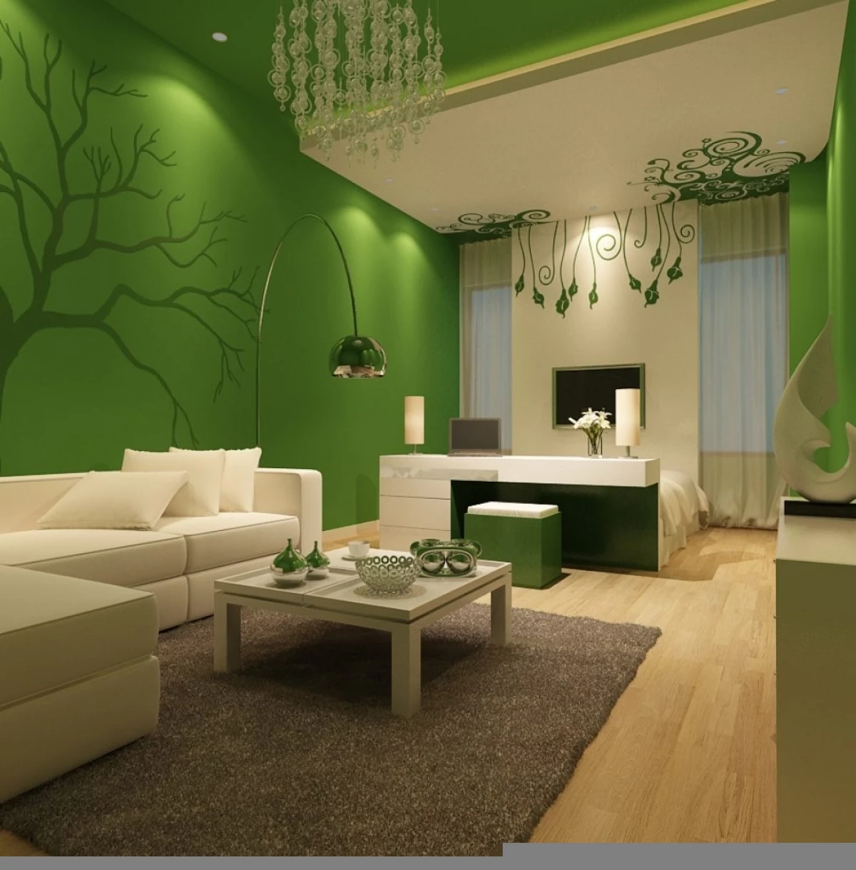
Due to the manifold shades, green is able to calm the psyche and just delight. In addition, it is with his help that a lack of real nature is possible to compensate in the metropolis.
Combine green
If you choose the interior design with the addition of wood, then it will embody comfort and pleasure. For example, you can make furniture items completely from the array, and the green shade will get only some facades.
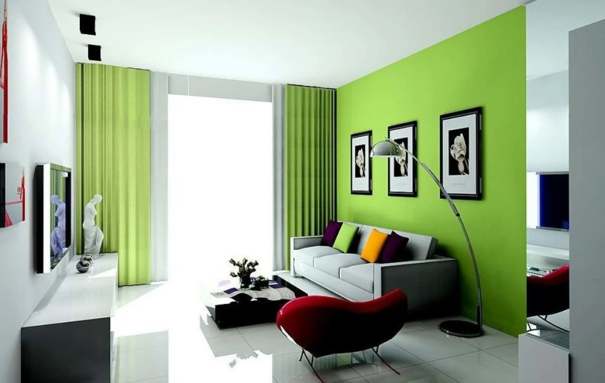
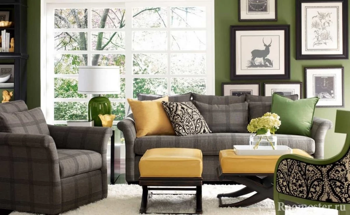
For the living room it is recommended to choose a dark green tone in combination with the color of forest needles. They are most active and noticeable in the interior, but only in the presence of brown or yellow-orange. Do not give up lilac and light blue.
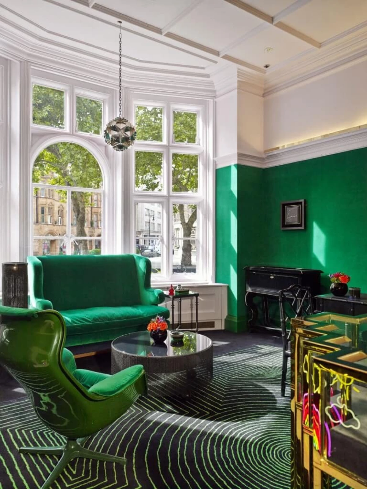
In any interior, the presence of olive color will be appropriate. The shade is complex and warm enough, so it is allowed to add to classic or modern style. It is possible to combine olive with brighter colors or, on the contrary, cold.
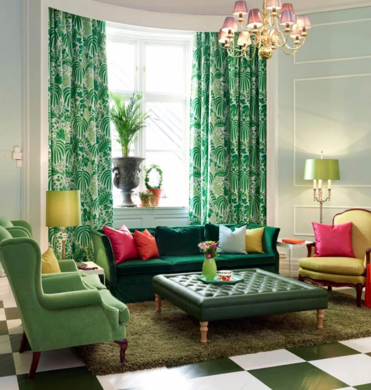
Green looks great in conjunction with the main palette of shades. It is important to be able to properly arrange priorities to highlight the main and additional colors to emphasize the overall design design of the interior.